

HYANG (aroma in Korean) is a K-beauty inspired diffuser packaging collection. After analyzing the rise in Korean beauty industry in the US market, I created this reed diffuser set based on the most emblematic native floral scents of South Korea. While managing a minimal aesthetic, Hyang diffusers embrace both traditional and contemporary styles.
SKILLS
Branding
Package Design
PROGRAMS
Illustrator
Photoshop


MOODBOARD
The moodboard began with researches about Korea and its traditional art. I was especially inspired by Hanji, a Korean rice paper, the designs of traditional stamps, as well as native flowers and the nostalgic value it held in Korean literature. I paid close attention to find the balance between the “clean minimal” style without losing touch of its Korean origins.

INITIAL SKETCHES
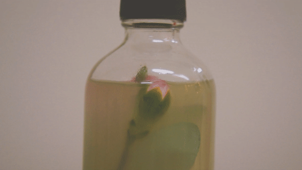
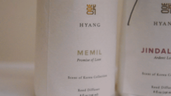
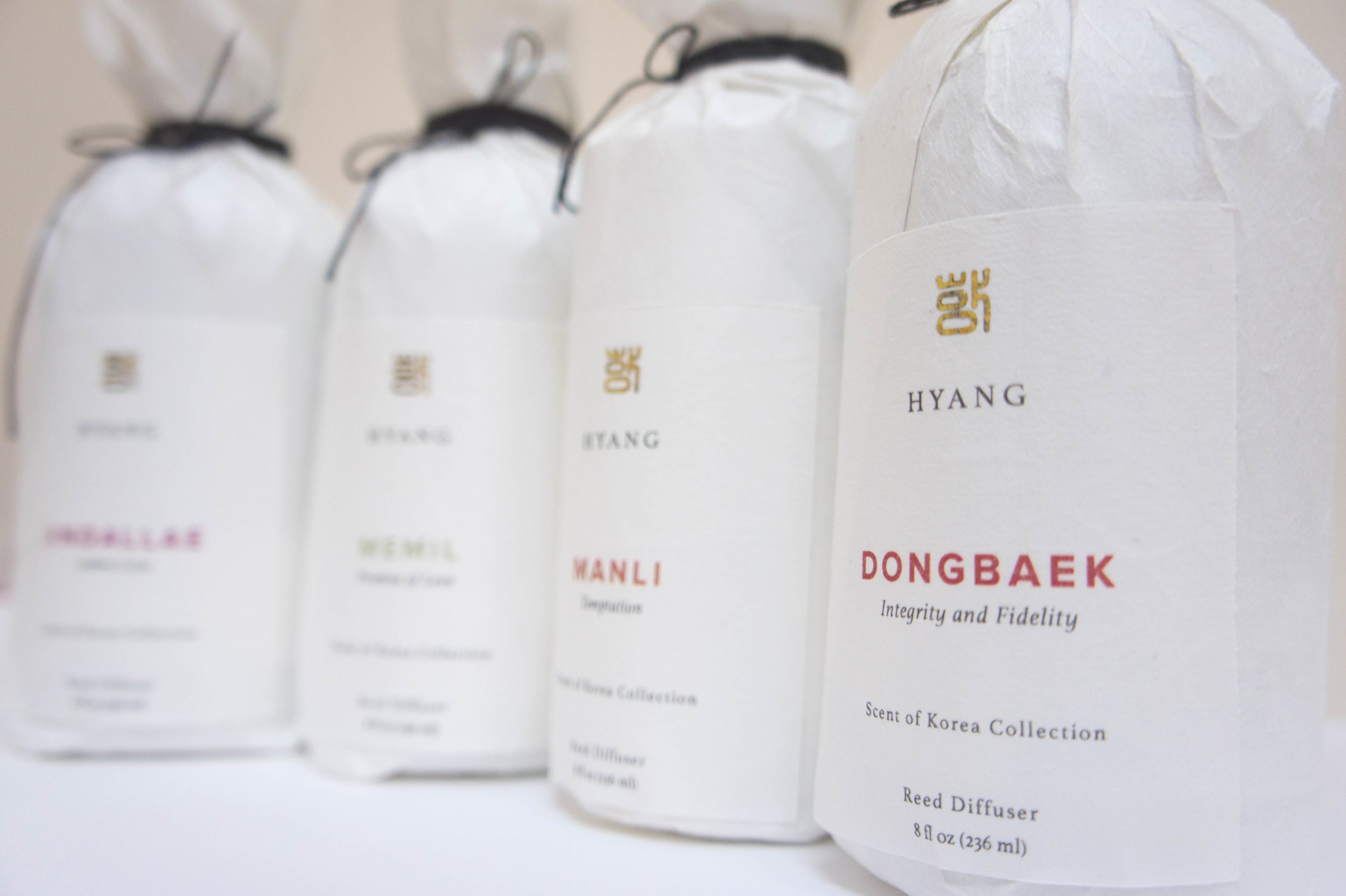
Initial sketches include name explorations both in English and in Korean. In the end, I chose Hyang which means aroma because I thought stylizing a Korean word in an elegant serif typeface would bring fourth a good balance of traditional yet minimal look. I also thought including a dried flower of the diffuser’s scent within the bottle will further enhance the US consumers experience with the native flowers. This concept became the basis of my package designs for this scent collection.

FINAL LOGO + BRANDBOARD
Initial sketches include name explorations both in English and in Korean. In the end, I chose Hyang which means aroma because I thought stylizing a Korean word in an elegant serif typeface would bring fourth a good balance of traditional yet minimal look. I also thought including a dried flower of the diffuser’s scent within the bottle will further enhance the US consumers experience with the native flowers. This concept became the basis of my package designs for this scent collection.